Understanding Stock Market Charts for Beginners: A 2026 Strategic Guide
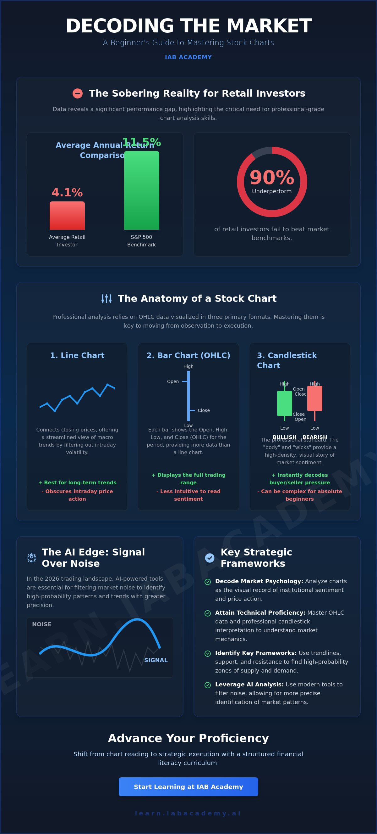
While 15% of U.S. adults now participate as retail investors, Gitnux data from May 2026 reveals a sobering reality: 90% of these individuals underperform market benchmarks. Most retail portfolios average a 4.1% annual return, falling significantly short of the S&P 500's 11.5% performance. This gap often stems from a fundamental struggle with understanding stock market charts for beginners, where the fear of misinterpreting data leads to capital erosion. You aren't alone if you feel overwhelmed by the sheer density of technical indicators or the difficulty of separating historical noise from actionable probability.
This strategic guide will empower you to master the visual language of global markets with professional-grade precision. You'll learn to move past the noise by integrating foundational technical analysis with the AI-powered tools that are now defining the 2026 trading landscape. We'll break down the essential frameworks for identifying market trends and demonstrate how AI simplifies complex data into manageable insights. By the end of this analysis, you'll have the confidence to use charts for rigorous risk management and long-term professional growth in an increasingly sophisticated ecosystem.
Key Takeaways
- Decode market psychology by analyzing charts as the primary interface between institutional sentiment and price action.
- Attain technical proficiency in understanding stock market charts for beginners by mastering OHLC data and professional candlestick interpretation.
- Identify high-probability zones of supply and demand through the disciplined application of trendlines, support, and resistance frameworks.
- Leverage AI-powered tools to filter noise from signal, allowing for more precise identification of continuation and reversal patterns.
- Shift from observation to strategic execution by integrating technical analysis into a broader, structured financial literacy curriculum.
The Visual Language of Global Markets: Why Charts Matter
Charts represent the primary interface between an individual investor and the collective consciousness of the global financial system. When you approach the task of understanding stock market charts for beginners, it's vital to view these visuals not as static images, but as dynamic records of human behavior. Every tick, candle, and trendline aggregates the decisions of millions of participants, from high-frequency institutional algorithms to retail traders, into a stream of actionable data. Within a comprehensive stock market framework, charts serve as the definitive map for timing. While fundamental analysis seeks to explain the "why" behind a company's valuation, technical analysis identifies the "when" of market entry and exit.
The Shift from Data to Insight
Professional investors utilize charts to validate broad macroeconomic trends rather than reacting to isolated headlines. The daily news cycle often produces significant noise that can distract from the underlying signal of a long-term trend. By applying Technical Analysis Principles, you can filter this volatility to identify sustained price action. This process requires an understanding of sector relevance; a chart for a technology stock will exhibit different volatility characteristics than one for a utility provider. Mastering this distinction is essential for identifying which data points actually influence your capital's security. You'll find that institutional players don't just look at price; they look at how that price confirms or denies the broader economic narrative.
The Psychology of Price Action
Price action is the visual manifestation of fear and greed. These primal emotions create the recognizable shapes and patterns that appear across different timeframes. Because human psychology remains relatively constant, historical price levels often repeat. This creates zones where buyers or sellers consistently intervene. Recognizing these psychological benchmarks isn't just about predicting profit. It's a foundational requirement for effective risk management. By identifying where the market has historically struggled or found support, you establish a logical basis for protecting your portfolio. Understanding stock market charts for beginners involves learning to read these psychological footprints to anticipate future probability rather than reacting to past events. It's about developing the discipline to see the market as it is, not as you wish it to be.
Anatomy of a Stock Chart: Line, Bar, and Candlestick Formats
Mastering the technical landscape requires a precise comprehension of how price data is visualized. In professional technical analysis, three primary formats dominate the interface: line charts, bar charts, and candlestick charts. Each format relies on OHLC data, which stands for the Open, High, Low, and Close prices of a security over a specific duration. This four-point data set forms the bedrock of every price point you'll analyze. When you're understanding stock market charts for beginners, choosing the right format is not a matter of preference. It's a strategic decision based on the density of information required for your specific objective.
Line Charts: Tracking the Closing Narrative
Line charts offer the most streamlined view of market activity by connecting only the closing prices over time. Many long-term investors prioritize the closing price because it represents the final daily consensus between buyers and sellers. This format is exceptionally effective for identifying macro trends without the distraction of intraday volatility. However, the simplicity of a line chart is also its primary limitation. It obscures the price range and the battle between market participants that occurs during the trading session. For those seeking a deeper dive into market mechanics, a professional guide on How to Read Stock Charts can help clarify when this simplicity serves your portfolio strategy.
Candlestick Charts: Decoding Market Sentiment
A Candlestick is a visual representation of price sentiment within a specific timeframe. This format provides high-density information through its two main components: the real body and the shadows, or wicks. The body illustrates the distance between the open and close, while the wicks show the price extremes reached during the session. For example, a long upper wick signals bullish exhaustion, indicating that while buyers pushed prices higher, they were unable to maintain those levels against selling pressure. Color coding provides an instant sentiment snapshot; green or white candles typically denote bullish sessions, while red or black candles indicate bearish control. To sharpen these interpretive skills, engaging with AI-powered investing education can help you distinguish between significant sentiment shifts and temporary market noise. Understanding these nuances is a prerequisite for moving from passive observation to active, data-driven decision making.
Identifying Market Frameworks: Trendlines, Support, and Resistance
Establishing a structural framework is the next critical step in understanding stock market charts for beginners. Without these frameworks, price action often appears as a series of disconnected, random movements. A trendline serves as the primary tool for determining market direction, categorizing the environment into three specific regimes: an uptrend, a downtrend, or sideways consolidation. To draw an accurate trendline, you must connect at least three distinct price points. While two points can suggest a potential trajectory, a third touch confirms the trend's validity and provides a reliable basis for future projections. These lines aren't just decorations; they represent the path of least resistance for a security's price.
Support and resistance represent zones of high-density buy and sell orders. It's helpful to view these not as thin lines, but as psychological "battlegrounds" where institutional order flow concentrates. A vital concept for any developing investor is "polarity." This phenomenon occurs when an established resistance level is decisively breached and subsequently functions as a new support level. This shift in role indicates a fundamental change in market sentiment. It signals that participants who previously viewed a price as "expensive" now perceive it as "value," creating a new floor for future price action.
The Power of Trendlines in Strategic Planning
Distinguishing between short-term noise and primary market trends is what separates professional traders from novices. While intraday fluctuations may seem erratic, a primary trendline provides a steady narrative of the market's long-term intent. When price action experiences a "breakout"—a decisive move through an established trendline—it signals a potential shift in the market regime. Professionals use these technical breaks to set precise entry and exit points, ensuring their capital remains aligned with prevailing momentum. For deeper insight into these structures, you can reference the Schwab guide on how to read stock charts and trading patterns.
Supply and Demand Zones: Beyond Simple Lines
Supply and demand zones are often anchored to "round numbers," such as $100 or $500. These levels act as natural psychological barriers where the battle between buyers and sellers is most intense. In high-growth sectors, identifying these institutional support levels is essential for long-term success. For instance, understanding these key levels in technology stocks can significantly inform your strategy on how to invest in ai. By recognizing where the "smart money" has historically stepped in, you can manage risk more effectively and avoid entering positions at the peak of a retail-driven rally. This disciplined approach ensures that your technical skills serve a broader, professional investment objective.
Recognizing High-Probability Patterns and Leveraging AI Analysis
Once you've established a structural framework, the next phase in understanding stock market charts for beginners involves identifying recurring geometric patterns. These formations represent consolidated market energy before a decisive move. Professional analysts categorize these into continuation patterns, such as flags and pennants, and reversal patterns, including the head and shoulders or double tops. However, a pattern alone is insufficient for execution. Volume serves as the essential validator; a breakout on low volume is often a "bull trap," whereas high volume confirms institutional participation and directional conviction.
In the current market environment, manual pattern recognition is increasingly supplemented by automated systems. While legacy education focuses on drawing these shapes by hand, modern proficiency requires the integration of technology. You must learn to distinguish between a temporary pause in a trend and a fundamental shift in market regime. This distinction is vital for protecting capital and ensuring your entries align with institutional order flow. AI delivers speed. Humans provide context. Together, they create a robust system for navigating volatile price action.
Continuation vs. Reversal: Knowing the Difference
Continuation patterns, like triangles and flags, suggest the prevailing trend will persist after a brief consolidation. These are generally safer for those focused on understanding stock market charts for beginners because they don't require timing the exact bottom or top of a move. Reversal patterns, conversely, signal that a trend has exhausted its momentum. Attempting to trade a reversal without confirmation is often called "catching a falling knife," a high-risk maneuver that frequently leads to significant losses. Use a disciplined checklist before committing capital:
- Confirm a decisive price close beyond the pattern boundary.
- Verify that volume is expanding during the breakout move.
- Ensure the relative strength of the sector supports the individual stock's movement.
The AI Advantage in Technical Analysis
The integration of AI-powered trading tools has revolutionized technical analysis by eliminating human bias and emotional error. AI algorithms can scan thousands of global charts in milliseconds to isolate setups that meet specific criteria with 99% accuracy. These systems identify subtle nuances in price action that the human eye might overlook during periods of high volatility. AI assistants also provide real-time explanations of complex chart movements, acting as a digital mentor during live market hours. This technology doesn't replace human judgment; it acts as a professional validation layer. By leveraging AI-powered trading tools training, you can shift your focus from manual searching to high-level strategic execution.
Advancing Your Proficiency: From Chart Reading to Strategic Execution
Moving beyond the fundamental mechanics of understanding stock market charts for beginners requires a deliberate transition from passive observation to active strategic participation. Recognizing a candlestick pattern or a trendline is merely the first step; the professional investor must integrate these visuals into a broader financial literacy curriculum. This structured approach ensures that your technical skills are grounded in sound economic principles rather than isolated speculation. Before committing significant capital, utilize "paper trading" environments to simulate live market conditions. This practice allows you to refine your interpretive accuracy without financial exposure, establishing a baseline of proficiency essential for career survival in the global markets.
The path toward becoming a certified investor involves more than just identifying price direction. It requires a commitment to the specialized modules provided by IAB Academy, which are designed to align your skills with established industry standards. By moving through a disciplined educational path, you transform chart reading from a hobby into a professional competency. This progression is what distinguishes a retail participant from a sophisticated market operator who understands the high-stakes nature of modern capital allocation.
Building a Professional Risk Management Framework
Professional success is not built on a perfect win rate. It is built on the discipline of losing small and winning big. Chart reading informs this process by providing logical locations for stop-loss orders. For instance, a stop-loss should be positioned just below a confirmed support zone identified during your analysis. Your position sizing must then be calculated based on the "distance to support." If the technical setup requires a wide stop, the total capital allocated to that specific trade must decrease to maintain a consistent risk profile. This mathematical approach to the chart ensures that no single market error can jeopardize your long-term portfolio security.
The Role of Continuous Mentorship and AI Support
Mastery in a rapidly evolving technological landscape is rarely achieved in isolation. To facilitate this growth, our Smart Instructor™ functions as a 24/7 AI-powered tutor, providing instant chart clarification and real-time validation of your technical findings. This tool bridges the gap between theory and execution, offering the high-density information required to make informed decisions under pressure. By joining a global community of learners, you gain access to a professional ecosystem focused on validation and proficiency. To fully integrate these technical skills into a comprehensive wealth-building strategy, explore the options available in a personal finance class. This final step ensures your ability to interpret market sentiment serves your broader objective of long-term financial mastery.
The Path to Professional Market Proficiency
Achieving proficiency in understanding stock market charts for beginners is a foundational requirement for long-term career security in the financial sector. By mastering the visual language of price action and identifying the psychological frameworks that govern market direction, you move from passive observation to strategic execution. The integration of AI tools ensures your analysis remains objective, allowing you to filter out noise and focus on high-probability outcomes. This disciplined approach transforms technical analysis from a speculative exercise into a rigorous professional standard.
Take the next step in your professional development by securing a seat in our comprehensive training ecosystem. Master the Markets with IAB Academy’s AI-Powered Investor Curriculum and gain lifetime access to professional financial frameworks. Our Smart Instructor™ provides real-time support in 130+ languages, ensuring you never face complex data alone. Upon completion, you'll receive globally recognized certifications that validate your expertise in the global professional ecosystem. Your path to financial mastery starts with disciplined education and the right technological support.
Frequently Asked Questions
What is the best type of stock chart for a beginner to start with?
A line chart is the optimal starting point for macro trend identification, but you must quickly transition to candlestick charts for strategic depth. Candlesticks provide a high-density view of market sentiment that line charts lack. This transition is a core component of understanding stock market charts for beginners. By viewing the open, high, low, and close, you gain a deeper perspective on the intraday battle between buyers and sellers.
How do I know if a stock chart pattern is actually reliable?
Pattern reliability is determined by the presence of volume validation and confluence with established support or resistance levels. A pattern that appears in isolation is often a false signal. You should look for at least three confirming factors before committing capital. Professional frameworks prioritize patterns that align with institutional order flow, which significantly increases the probability of a successful outcome in volatile environments.
Can AI really help me understand stock market charts better than a human?
AI enhances your analysis by processing thousands of data points in milliseconds, but it functions best as a validation layer rather than a total replacement. AI tools remove emotional bias and identify subtle patterns the human eye might miss during high volatility. Human judgment remains essential for interpreting macroeconomic shifts and regulatory changes. Integrating both creates a superior hybrid strategy for navigating the 2026 digital ecosystem.
What is the difference between a bar chart and a candlestick chart?
The primary difference lies in the visual emphasis on the relationship between the opening and closing prices. While both formats display OHLC data, a candlestick chart uses a "real body" to provide an instant sentiment snapshot. Bar charts use small horizontal ticks on either side of a vertical line. Most professional traders prefer candlesticks because they make identifying bullish or bearish dominance more intuitive during rapid market movements.
How much time should I spend studying charts every day as a novice?
Novices should dedicate approximately 30 to 60 minutes daily to disciplined chart analysis and paper trading. Consistency is more valuable than sporadic, high-volume study sessions. This daily habit helps build the neural pathways required for rapid pattern recognition. Over time, this disciplined approach to understanding stock market charts for beginners leads to the high-level proficiency required for managing real capital in a competitive market.
Are chart patterns the same for crypto and stocks?
Chart patterns are fundamentally universal across all liquid asset classes because they reflect the constant nature of human psychology. Whether you are analyzing equities, forex, or cryptocurrencies, the principles of supply and demand remain the same. While crypto exhibits higher volatility, the geometric shapes like triangles and head and shoulders still function as reliable indicators of market sentiment and potential regime shifts in any liquid market.
What does it mean when a stock "breaks out" on a chart?
A breakout occurs when a security's price moves decisively beyond a predefined technical boundary, such as a trendline or resistance zone. This movement signals that the prevailing market equilibrium has shifted in favor of either buyers or sellers. For a breakout to be considered valid, it must be accompanied by an expansion in trading volume. Without volume, the move is likely a temporary fluctuation rather than a structural change.
Is technical analysis more important than fundamental analysis?
Neither is more important; they are complementary tools within a professional investment framework. Fundamental analysis identifies high-quality assets based on intrinsic value and economic health. Technical analysis provides the precision required for timing entries and managing risk. A sophisticated investor uses fundamentals to decide "what" to buy and technical charts to determine "when" to execute the trade, ensuring capital is deployed at the point of highest probability.
